 60 mins
 China
China  India
India  Japan
Japan  Philippines
  Singapore
  South Africa
  Sri Lanka
  Thailand
  Colombia
  Ecuador
  Austria
  Denmark
  Finland
  France
  Germany
  Hungary
  Norway
  Poland
  Portugal
  Romania
  Spain
Spain  Sweden
  Switzerland
  United Kingdom
  UAE
UAE  Canada
  Mexico
  United States
.svg)
Design Systems are challenging today, especially for enterprise companies with multiple products within their portfolio. Disparate product teams within a company need to design and develop product experiences aligned with a set of core principles, styles, and patterns. The objective is to create one coherent feel across multiple products and platforms — enabling consistency, speeding up workflow, and improving user experience.
Design Systems become all the more imperative for hospitality giants who need to ensure the same look and feel across multiple brands. A customer hopping through all these brands must be able to immediately relate to the design aesthetics.
But how to go for it? Let us explore.
Design Systems for the hospitality industry
Design Systems are becoming increasingly popular in the hospitality industry as businesses discover the many benefits and advantages. They provide a consistent look, feel, and user experience across all platforms and devices.
Here’s how a Design System can benefit the management in a hospitality industry:
- Improved brand recognition for your hotels: A design system provides a cohesive look and feel to your website, application, or store. Visitors will recognize and associate these with your brand. This increased brand recognition can boost customer loyalty and sales.
- Consistent user experience across any hotel website or application: A design system ensures that users will have a similar experience when interacting with all your hotel’s platforms.
- Increased productivity within hotel’s digital team: Design systems help make your product or service more efficient and streamlined—allowing you to leverage existing templates and focus on high-impact work. Over the long run, this equates to faster deliverables and cost savings for your hotel management.
- Lead hotel trends with faster time to market: A design system enables you to quickly react and deploy initiatives that respond to fast-moving hospitality trends in the market or even the season.
Getting Started – Design and Development Audit
To begin building a Design System, we first work with a company to identify the users of the system. By speaking with the users, (i.e. product designers and developers) we are able to understand the extent in which they want to leverage a Design System within their day-to-day workflow. From here we can assess the type of Design System best suited for their company (Is it strict or loose? Is it modular or integrated? Is it centralized or distributed?).
Although the requirements of a Design System may change from company to company, at its core, a Design System is comprised of three elements:
- Design Principles: A shared set of criteria on how to approach design across the organization.
- Style Guide: A comprehensive set of usage guidelines regarding the brand identity (i.e. color, typography, spacing, grid/layout, icons, illustration, motion, etc.)
- Component Library: A glossary of commonly used interface elements that can be scaled to multiple products.
In order to inquire about what elements of the Design System a company may already possess as well as additional elements they need developed, we run a design and development audit on their existing products. This audit works as a way to keep track of existing styles and components that could be a part of the Design System and to understand the context in which these elements are being used. Once we have a strong grasp of the existing styles and components, we can fill in any gaps and prioritize these into a Design System development plan.
Our Approach – Prioritizing Components
Our development plan starts by prioritizing the atomic levels of a Design System such as typography styles, color styles, and spacing rules. We refine these style rules first because they ultimately affect molecular elements of a Design System such as basic components (which can be made by a combination of typography, color, and spacing styles). We then build out the basic components (i.e. buttons, dropdowns, input fields, etc.) because these would be the building blocks for more complex components which may contain multiple basic components within them. For example, a modal component can be a combination of a card component, text input component, and button group component.
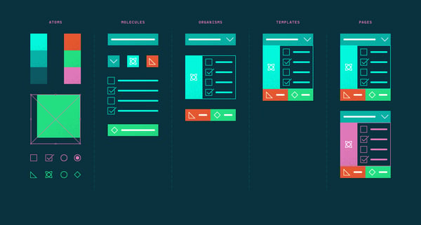 Atomic Design — a methodology by Brad Frost
By starting with the smallest elements we build the essential foundation for a robust Design System. Before we realize it, the Design System will grow to host over hundreds of different components with permutations.
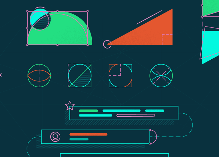
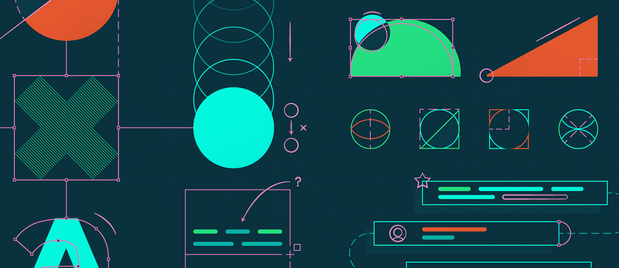
Testing the System – Make it & Break it
Whenever a component is built, it goes through extensive testing to make sure it follows the design principles set forth by the company as well as meeting the following criteria:
- Fluid: The component can be scaled to the designer, developer, and user’s needs.
- Accessible: The most common components and patterns are accessible to all users.
- Consistent: The existing atomic foundation of colors and styles are used. Evaluate if particular variations are necessary or could be simplified.
- Function: The component has ease-of-use; therefore, simplify the anatomy of each component as much as possible so that every design decision is purposeful.
With this guiding criteria we can ensure that the Design System meets both design and development expectations.
After extensive iterative testing, each component upon approval is added into the Design System and polished to make sure the layer names, layer ordering, symbol structure, and symbol hierarchy are easily understood by designers who did not build the patterns. Simultaneously, these components will also be taken by a developer and converted into reusable frontend code that will be deployed to future products.
Documentation – Be Thorough
Documentation is a critical step during the development process because it acts as a medium to empower other designers and developers within a company to utilize the Design System. After a component is complete, we provide any additional design notes explaining the purpose, intended behavior, and best practices of each component. This is supplemented with additional development documentation such as component code snippets.
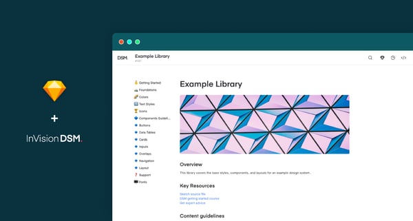
Tools like InVision DSM allow designers to simultaneously create and document components.
It’s important to note that documentation shouldn’t just be written once and then left alone forever. Design System documentation should be a living and breathing document that evolves over time.
Takeaways
Balance: A design system needs to have the appropriate amount of balance between offering a comprehensive set of rules, guides, and documentation while also leaving more space for experimentation.
Integration: Create a design system that meets with designer’s and developer’s workflow. The more integrated the design system, the more likely it will be adopted and widely-used.
Organization: Plan the organization and structure of the design system early in the process. Maintain a glossary or some sort of way to keep track of the components and prioritize through a road map. Documenting throughout the development process drives adoption and clarification.
Overall, Design Systems create a bridge between designers and developers that allow for faster ideation at a fraction of the cost. Rather than focusing on the nitty gritty details of design or development, product teams can focus on building quality user experiences that remain consistent across a portfolio of products. Design Systems are quintessential in developing evolving products that are scalable and everlasting.
Are you looking for a comprehensive design system to help bring your hospitality business to the next level? Nagarro can help you supercharge your hospitality business and leave a lasting impression on your customers. Just connect with us, and we can take the conversation forward from there.