services
A holistic approach that accelerates your current vision while also making you future-proof. We help you face the future fluidically.

Digital Engineering

Value-driven and technology savvy. We future-proof your business.

Intelligent Enterprise

Helping you master your critical business applications, empowering your business to thrive.

Experience and Design

Harness the power of design to drive a whole new level of success.

Events and Webinars

Our Event Series

Sommelier

Turntable

Featured Event
24 - 25 Apr
Virtual event: 7 live sessions
Our Latest Talk
By Kanchan Ray, Dr. Sudipta Seal
video icon 60 mins
About
nagarro
Discover more about us,
an outstanding digital
solutions developer and a
great place to work in.
Investor
relations
Financial information,
governance, reports,
announcements, and
investor events.
News &
press releases
Catch up to what we are
doing, and what people
are talking about.
Caring &
sustainability
We care for our world.
Learn about our ESG
initiatives.

Fluidic
Enterprise

Beyond Agility, the convergence of technology and human ingenuity.
talk to us
Welcome to digital product engineering
Thanks for your interest. How can we help?


RMS
Design System

Building an Enterprise Design System from Scratch

Industry

Risk Management

Expertise

Design System
Product Design
User Interface
Documentation

Platforms

Web
Mobile

Deliverables

User Experience
User Interface
Strategy

Introducing RMS

Providing risk management solutions

RMS provides hundreds of insurers, financial institutions, and corporations with models, technology, and services to manage catastrophe risks throughout the world.

The world's leading risk management company approached Nagarro to create a scalable, modern design system that allowed them to streamline their design process and promote consistency across their products and applications.

Building design systems for RMS

Design Systems are becoming increasingly valuable because they create a single unified experience across multiple products and platforms — promoting consistency, speeding up workflow, and improving user experience. Design Systems allow for several product teams within a company to design and develop product experiences while adhering to a set of core principles, styles, and patterns.

The challenge

With an expanding portfolio of products, RMS wanted a unified experience for their customers and a centralized design language for their product designers and developers.

Working closely with RMS, we created a robust design system of visual styles, components, and code values that enable RMS to prototype and experiment with ideas in high fidelity faster and at a lower cost.

Building a unified customer experience and centralized design language_RMS

robust design system of visual styles, components, and code values that enable RMS to prototype and experiment with ideas in high fidelity faster and at a lower cost.


Our approach

Creating a unified language

To work through these challenges and keep our decision-making process fast, we created a dedicated Slack channel. We invited a small group of designers and engineers so we could dedicate ourselves to designing and building the RMS Design System.

The goal of the Design System was to create beautiful and accessible products with a unified design language. To reduce implementation effort, our components needed to be reusable and adaptable to any platform. To be as efficient as possible, we narrowed the initial scope by creating the system first for Desktop.

designing and building the RMS Design System

Laying the foundation

Our initial step was to determine what elements of the design system RMS already had, and understand what parts we still needed to create.

Line

We ran a design and development audit on their existing products to loosely define the foundation of the design system — gathering color, typography, spacing, and essential component styles. This discovery phase provided us a clear roadmap and allowed us to begin defining our standardized components.

Line

We started by prioritizing the atomic levels of the Design System — typography styles, color styles, and spacing rules. We defined these rules first because they would ultimately affect the molecular elements of the system. We then built out the essential components (i.e. buttons, dropdowns, input fields, etc.) because these would be the building blocks for more complex parts. By starting with the smallest elements first, we built the foundation for a robust Design System.

“Nagarro is an extension of our own team.”

Mike Cummings
Lead Designer, RMS

Scope
of Work

Discovery

Workshop
Research
Project Planning


Design

Visual Moodboards
Prototyping
UI Design
UX Design
Illustration
Iconography
Documentation

Strategy

Stakeholder Alignment
Persona Development
Information Architecture
Product Roadmapping
User Experience


Quality Assurance

Usability Testing
Accessibility Testing
Performance Testing
Functionality Testing

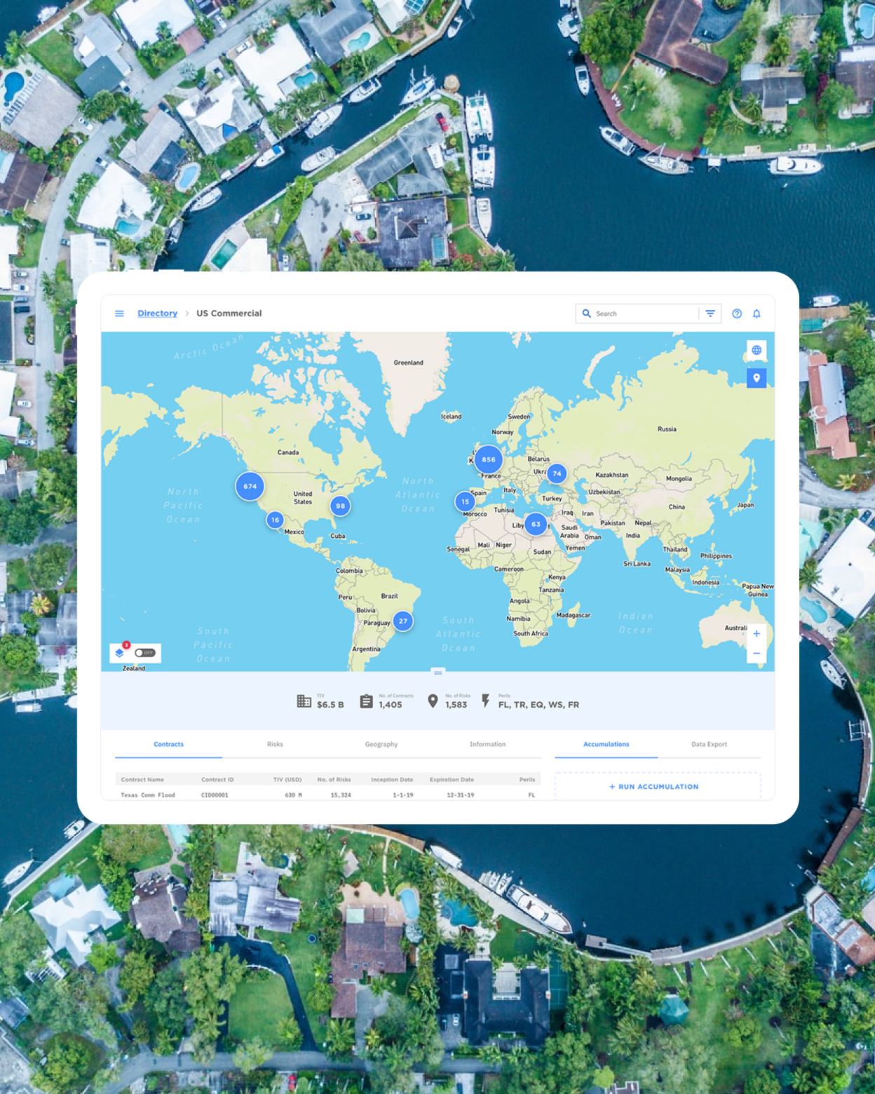
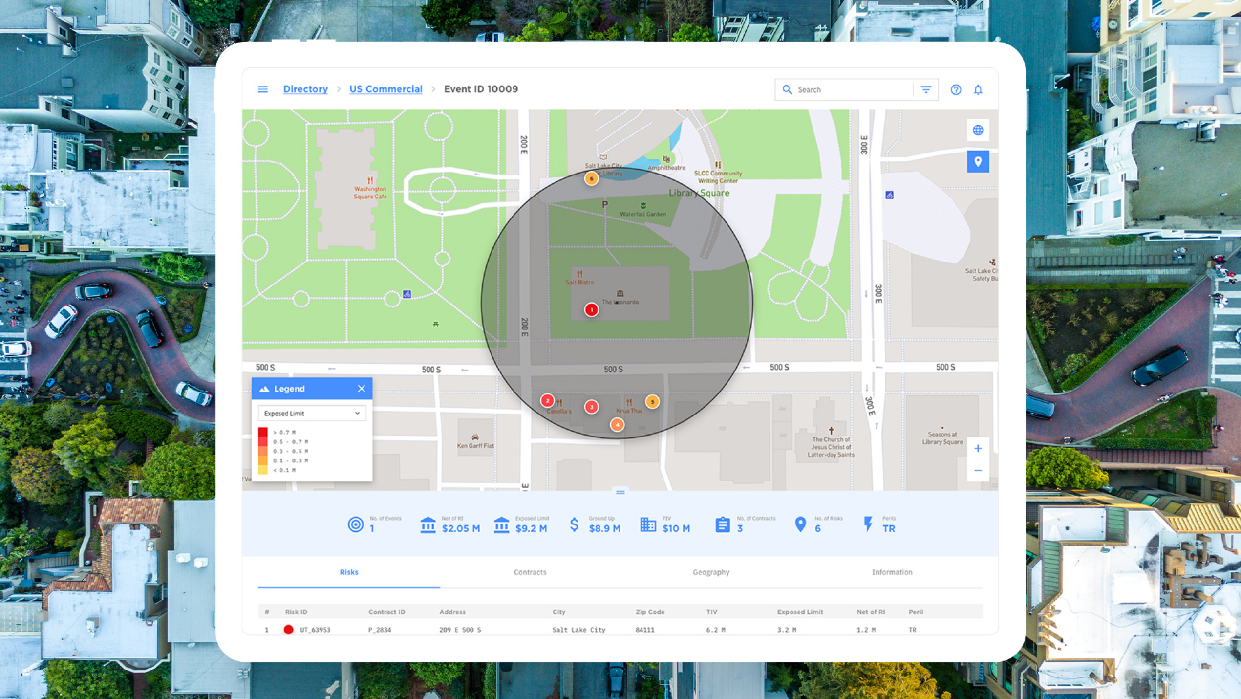
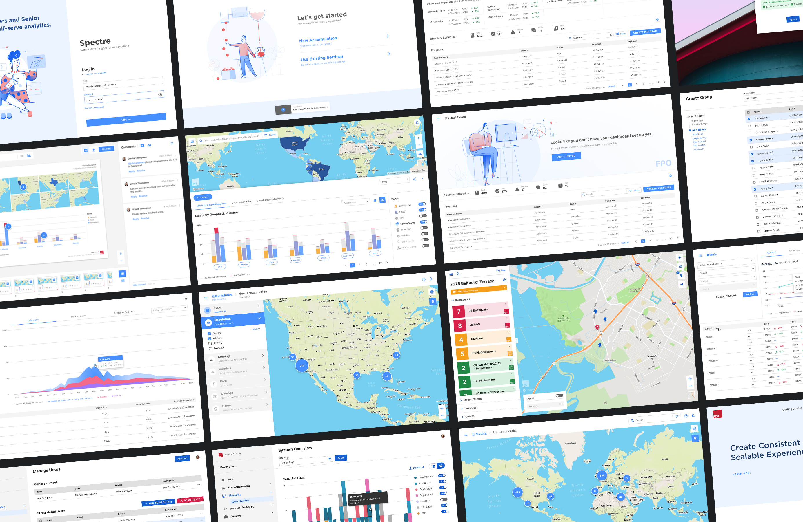
Overview of RMS UI – app screenshots

Implemented workflow

Making things better for everyone

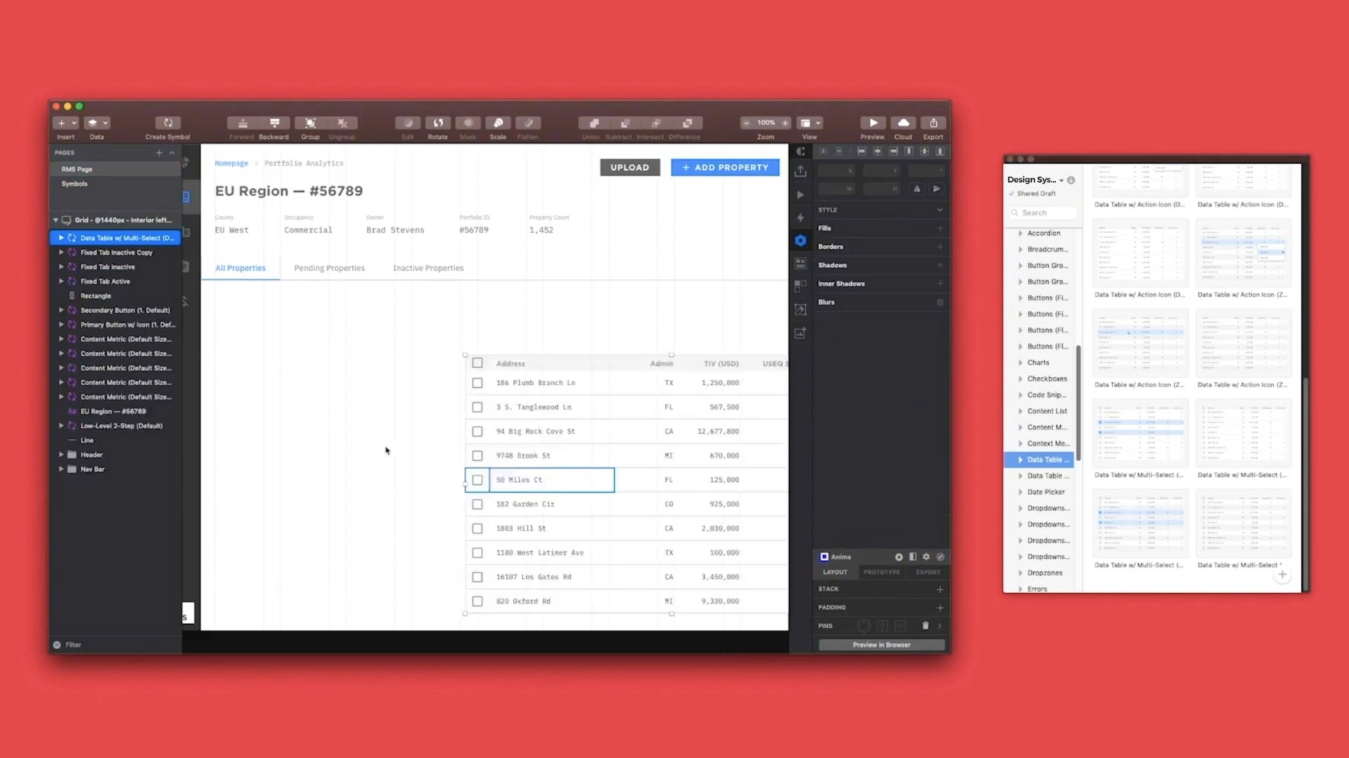
To build and manage our Design System, we use Sketch and Abstract. We have several Sketch Libraries, shared between all projects, which have their specific components. Abstract is a versioning control tool that allowed members of our design team to create their own branches of a particular Sketch Library, and freely explore and create components. Once created, we move to a review process, components are added to the Design System by merging that branch to the Master, without the risk of overriding a designer's work. Abstract also works as a shared workplace for collaboration where we have the design files for all products, so everything is always accessible to everyone.

The technical strategy

In addition to our workflow, we developed a custom Sketch plugin that we named Chord. Chord helps us manage design tokens and improve configuration flexibility. Any updates to the design system are automatically synced with both design and code on every product, resulting a frictionless process.

Getting developers involved early in the design process, led us to create Chord — our custom plugin that keeps the RMS Design System synced between design and code.
“The RMS Design System helps us deliver consistent, scalable and easy to use experiences. We are saving time and money bringing industry-leading applications to market.”

Olga Convey
SVP, Application Experience, RMS

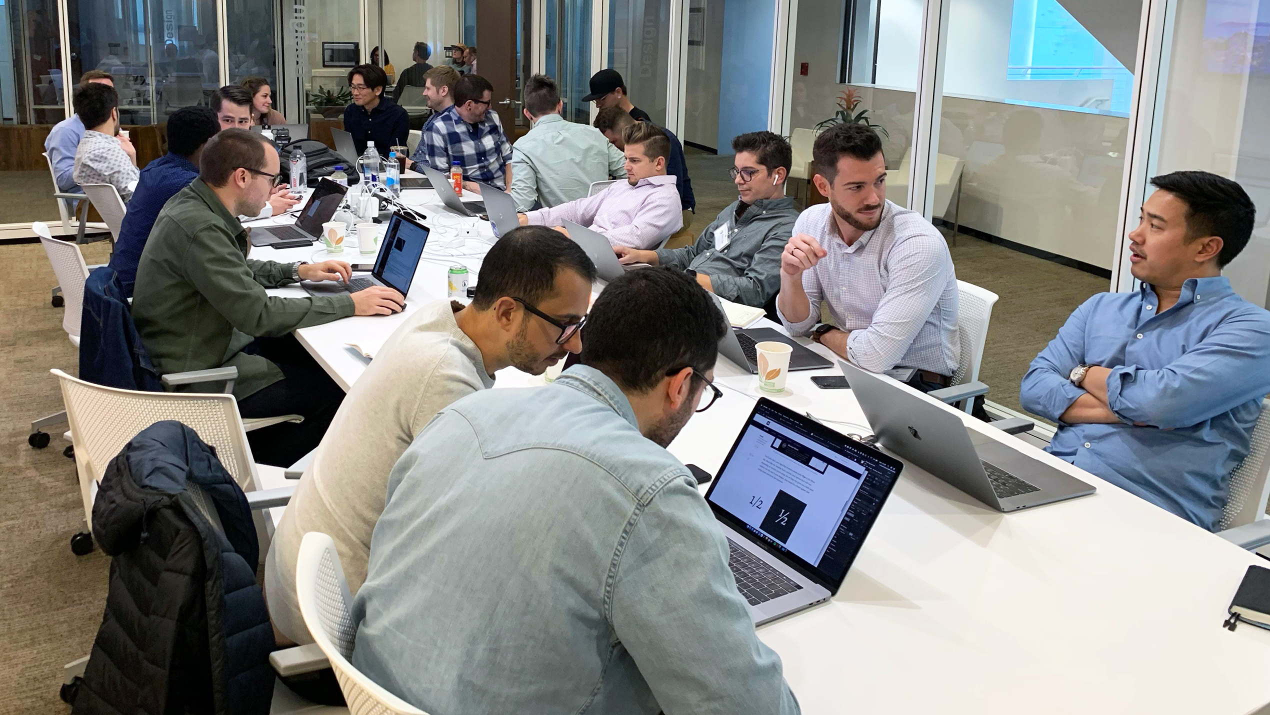
Nagarro and RMS team during a design system workshop session

Nagarro and RMS team during a workshop session

Collaboration

Support all teams

The key priority of the RMS Design Systems Team is the ability to support Designers while keeping a high level of quality, consistency, and usage of components and patterns.

Line

The most crucial process that we have is communication. When the design system team communicates the purpose, usage, and best practices of each component or pattern — designers have more time to focus on creating a better user experience, rather than pushing pixels.

Line

Abstract for Sketch allows multiple designers from the team to work on a single shared library file at the same time, and then push changes to the Master. This setup proved to be an excellent way to experiment and propose better solutions to existing problems, without affecting existing app design.

Team workflow

If designers face difficulties finding the component or pattern that applies to their use case - they can propose a new component or solution that solves the problem. If other apps will benefit from the proposed solution, the RMS Systems Design Team adds it to the more extensive Design System.
To keep track of all our ideas, proposals, issues, and bugs, we used Jira and Confluence as a single source of truth for the process.

designing and building the RMS Design System
Creating an enhanced product experience for RMS design systems

Component creation

Focus on product experience

We worked with RMS to make sure each component worked and behaved as intended. With a large inventory of components and a variety of applications, we created components that could easily resize and be useful on any platform. Our goal was to design pixel-perfect and straightforward components that enabled RMS designers and developers to focus on designing the product experience, rather than worrying about spacing, color, or type values.
To avoid issues with symbols and to give designers the ability to iterate and create new components for each product, we have a dedicated Sketch Library that’s connected to the Design System and the product main Sketch file.

Compiling the library

We initially started using Invision DSM but due to the lack of functionality and some workflow issues, the designers moved to Sketch Shared Library. As the Design System evolved, the quantity and complexity of components became greater, as a result, working with the design system file became untenable. It became clear to us that we needed to break our design system files into manageable pieces.

Line

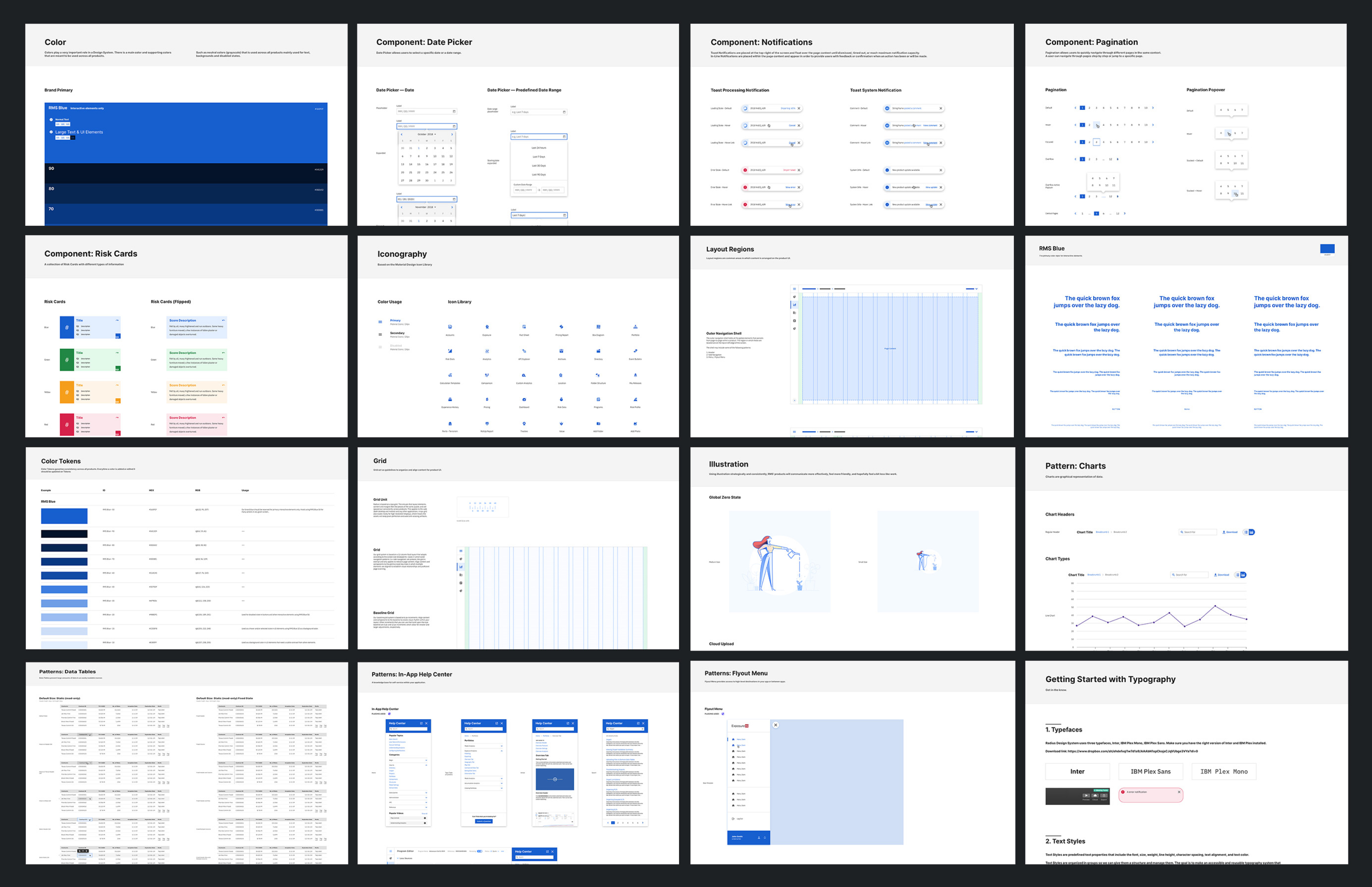
The RMS design system consists of multiple Sketch Shared Libraries connected one to another.

Line

Master Library

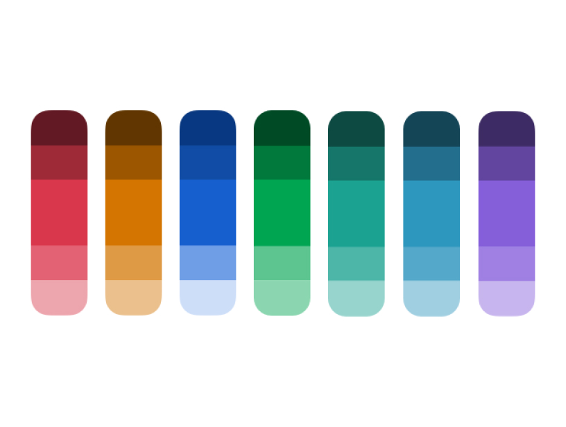
Includes Core elements, such as colors, shapes, typography, layer styles, and more.

Quality Assurance

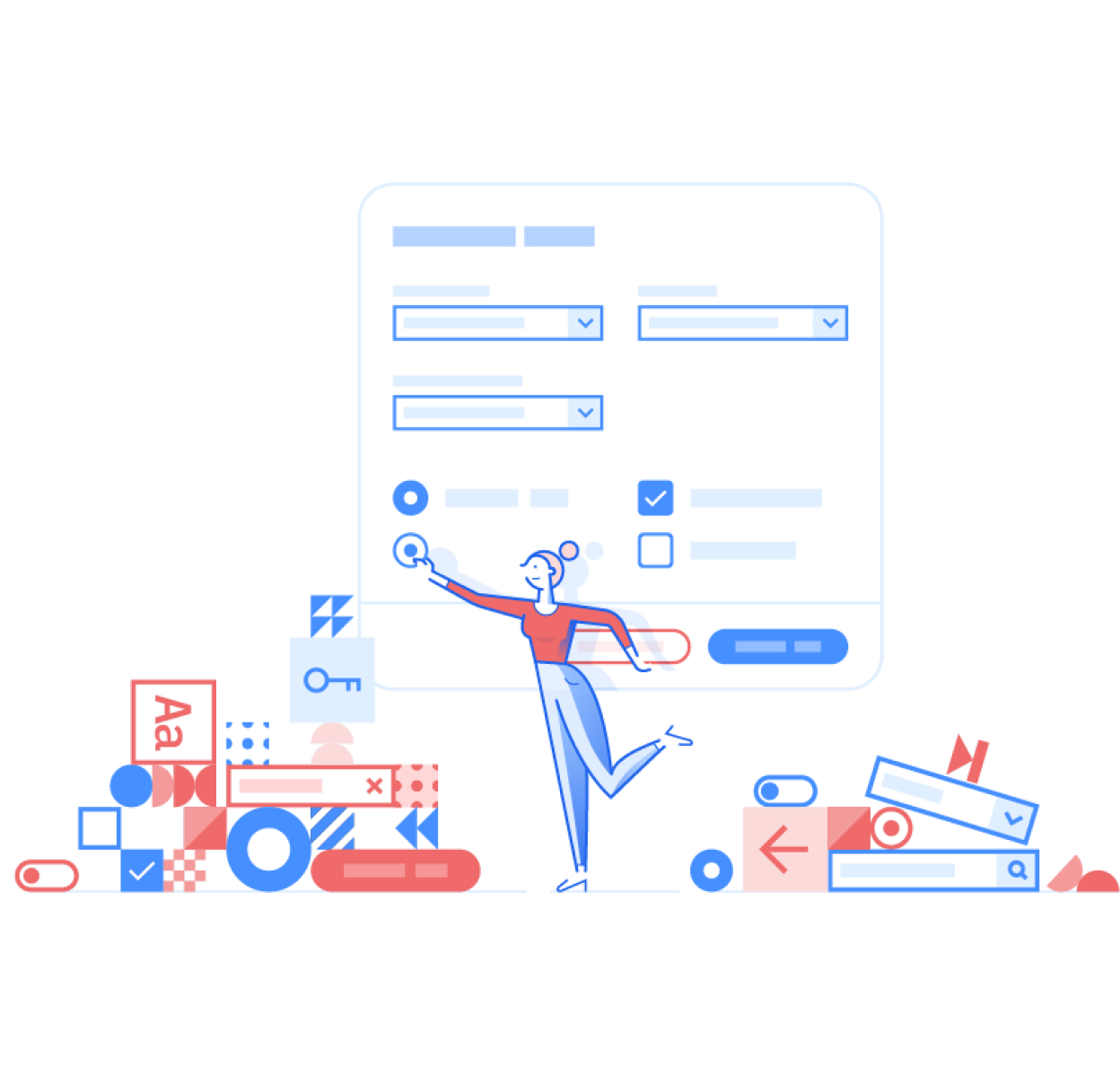
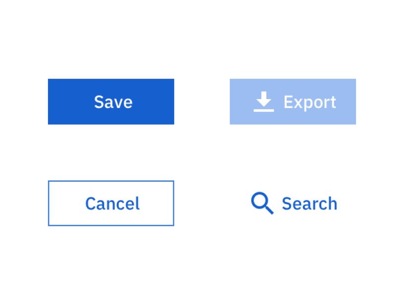
Actions — text, icon buttons, toggles and drop-zones.
Forms — inputs, dropdowns, steppers and text areas.
Navigation — breadcrumbs, tabs and pagination.

Screenshot of RMS design system

Accessibility tests

Making the system usable for everyone

To ensure RMS products are usable for all people irrespective of their situation, abilities, or context, we run accessibility tests. The RMS design systems team continuously reviews the usage and accessibility of core design elements like colors, typography, and shapes — as well as components and patterns to ensure we create the best experience for all app users.

RMS design systems team continuously reviews the usage and accessibility of core design elements like colors, typography, and shapes

RMS design systems team continuously reviews the usage and accessibility of core design elements like colors, typography, and shapes

RMS design systems team continuously reviews the usage and accessibility of core design elements like colors, typography, and shapes

Image 123

Illustration

Distinctive style

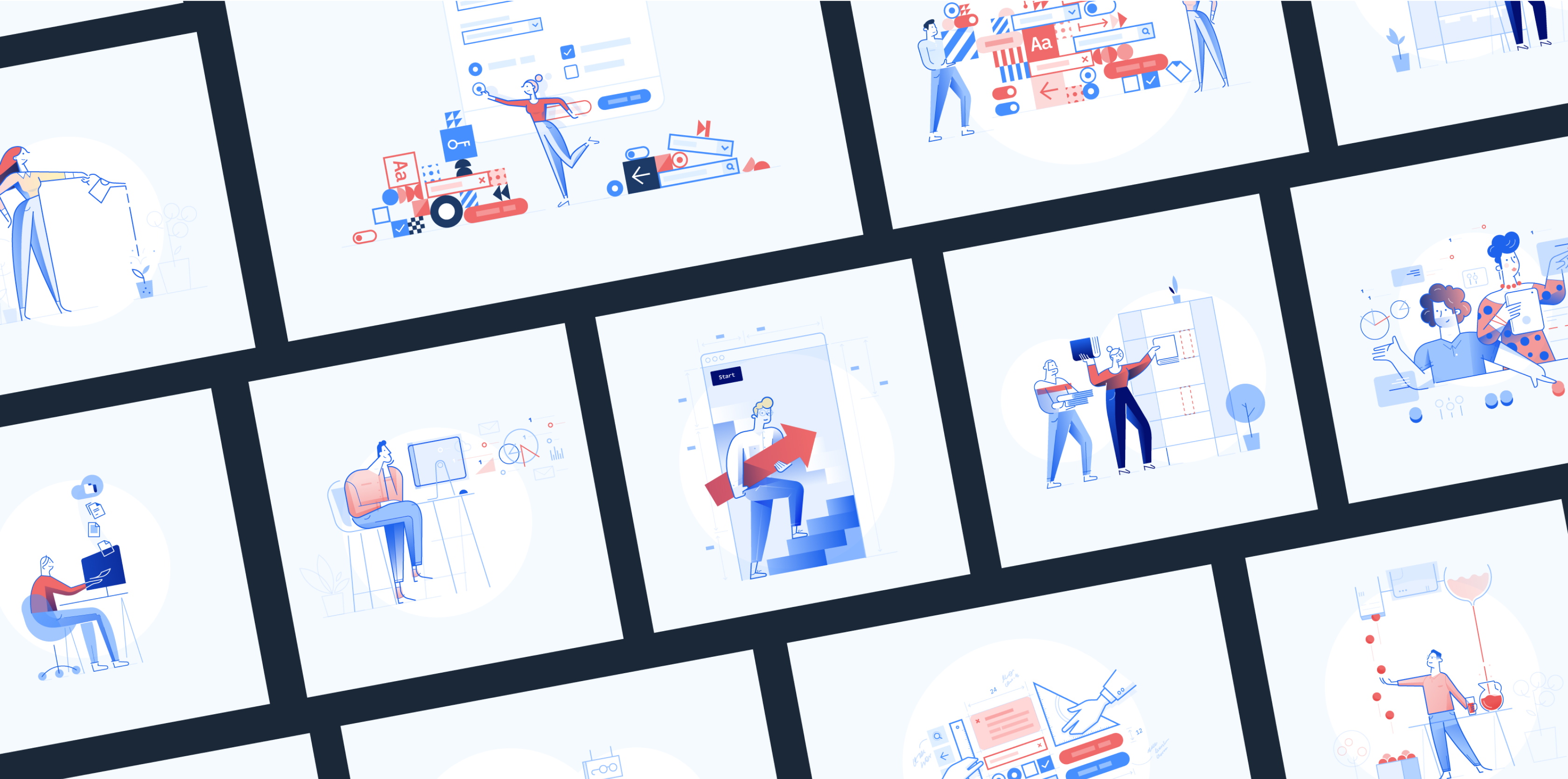
To achieve consistency across all RMS products, we created custom illustrations and iconography (concept, color, and style) that bring humanity and friendliness to the digital products and communicate complex actions and processes more effectively.

We approached the illustration work with a goal on our minds: to avoid the beaten path and go for a distinctive style. A mood board was set up to make us aware of what would and wouldn't work for RMS business. With that in mind, we were able to find a distinct illustration style for RMS - one that was recognizable, friendly, and unobtrusive. One other factor was at play: the need to have other designers easily replicate this visual language.

Bringing humanity and friendliness to RMS products

During this process, we set the principles and guidelines to be followed, such as the setting, environment, characters, and concepts to convey. We settled on representing the typical RMS customer environment (in an office or meeting room), as well as dressing them formally and promoting diversity by using a mix of races and genders. We also determined that illustrations should be supportive of the workflow a user is trying to complete. It is encouraged to simplify or use abstract notions to communicate complex concepts from that workflow.

Line

Usually, illustrations start from a hand-drawn sketch, to explore freely and test different variations before going digital. We set rules for the color palette, line weight, geometry, and shading styles, as well as defining three different sizes for each application (optional), depending on the space it’ll occupy in each specific layout.

Line

Iconography for RMS design systems

Iconography

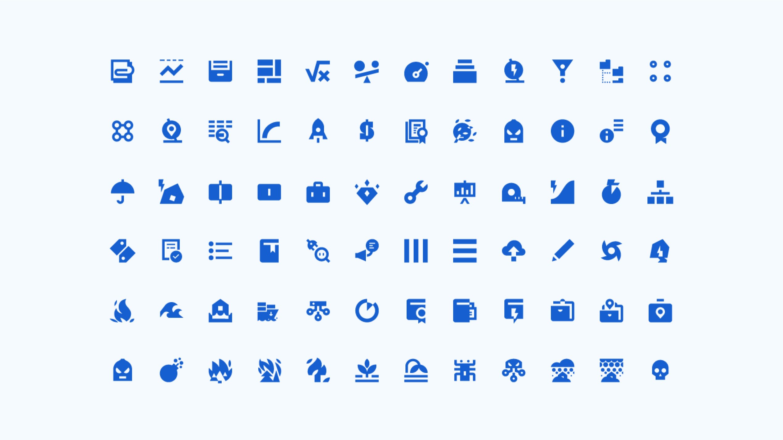
The RMS Design Systems iconography is unique to RMS' software suite. It consists of both simple definitions and very complex industry terms. While the former was achieved with the help of Google's Material Design icon library, the latter needed a custom approach. To unite these approaches, the iconography follows Google's Material icon construction rules.

As with illustrations, there is a process set up for requesting new icons/icon collections. The app designer submits a ticket in Jira with a detailed description of what this symbol should represent. Usually, one complex message will result in several icon versions, each with different approaches to the subject. These icons are created in Illustrator and then submitted to the design team via a "voting ballot" set up in InVision, promoting strong collaboration, discussion, and decision-making process. Next, the final icon is grouped into a larger set and submitted for review by selected RMS clients via a poll on UsabilityHub. If the icon is accepted, it is merged with the Icon Library.

Documentation

All resources in one place

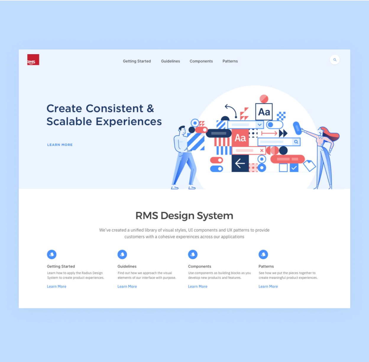
To drive the adoption of the design system amongst RMS product teams, we offered extensive documentation regarding components and tutorials on how to use them. We are using ZeroHeight to document and keep up to date, one place for all design system resources, guidelines, and processes. This approach allows everyone to be involved in contributing to and maintaining the design system.

Like any team, designers or developers might have questions about the behavior or usage of specific components or patterns. To avoid communication constraints, updated documentation allows both designers and developers to find information about component anatomy, usage, variations, and behavior. The "Integrated Code" tab enables developers to see the attributes and dependencies of each component.

Screenshot of documentation regarding design systems components and tutorial

Icon library

Building adaptative icons

The Icon Library includes two subsets of icons: Iconic and Illustrative. Iconic includes regular single-color icons rendered in both 24px and 18px - a concise, stripped-down version for better display at smaller sizes. Illustrative consists of multi-colored 36px scalable icons sitting halfway between icon and illustration. This subset is as informational as it is decorative.

Adaptive icons for product experience

Adaptive icons for product experience

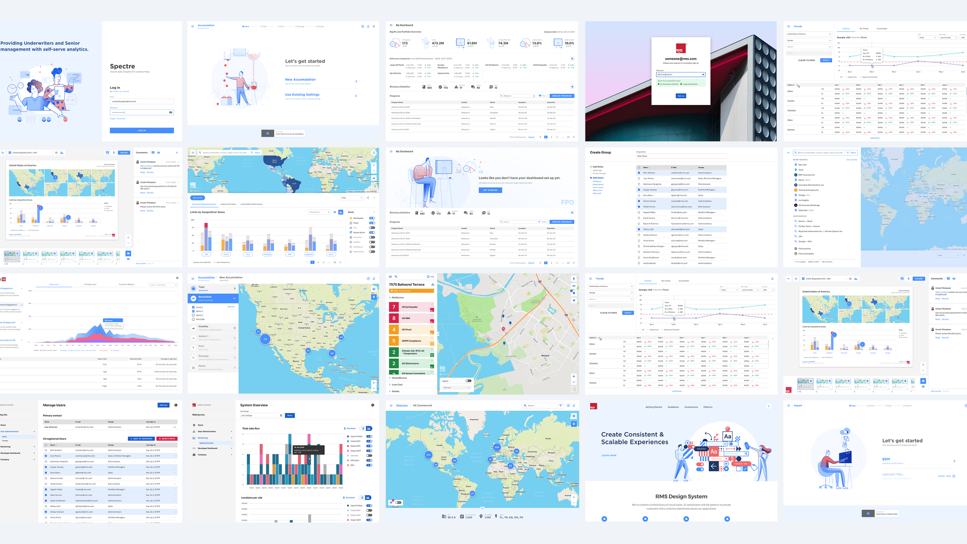
Overview of RMS UI – app screenshots

Summing it up

Working together towards the same goal

After more than a year of hard work, we released a top quality design system that serves as the single source of truth for both design and development — allowing for an efficient, consistent, and scalable customer experience. Today, Nagarro continues managing the design system to better support the teams that rely on it.

Press

- Dribbble Courtside
- DesignSystems.io

5+
fully functional products built in less than a year
30%
time saved in prototyping
$50k
saved per release in cleaning up UI issues
100+
components created and growing

“We appreciate working with Nagarro so much. Our Design System is incredible because of their approach to craftsmanship.”

Mike Cummings
Lead Designer, RMS