The design system is becoming a decision system

insight
October 10, 2026
9 min read

Author

Hugo-Franca-Nagarro-2

Hugo Franca is the Director of Product Design based in Lisbon, Portugal, with a comprehensive background in product experience and innovation. At Nagarro, he helps clients transform, adapt, and build new ways into the future through a forward-thinking, agile and caring mindset. He also helps organizations create smart and purpose-driven product solutions, delightful user experiences and perfect digital interfaces.

Executive summary

As AI increasingly participates in product design and development, traditional design systems are reaching their limits. While most systems document components, styles, and patterns, they rarely capture the judgment behind them: why a decision was made, when a pattern should be used, what alternatives were rejected, and how quality is evaluated. As a result, AI can generate technically correct experiences that still violate business rules, accessibility requirements, or core product principles. The next evolution is the design system as a decision system, where design knowledge becomes explicit, reusable, and machine-readable.

A decision system combines components with intent, governance, accessibility, quality checks, and decision history, enabling both people and AI to make better design choices. By creating a shared source of truth across design and code, recording examples and anti-examples, and making quality testable, organizations can reduce inconsistencies, scale expertise, and ensure AI-generated experiences remain aligned with product standards. In an AI-driven future, competitive advantage will come not from generating interfaces faster, but from codifying the decisions that make those interfaces effective.

Generating a component or an interface is getting easier. Generating one that belongs in a specific product is still hard.

An AI tool can produce valid code and still pick the wrong component, break the hierarchy, skip a required state, create an inaccessible interaction, ignore a business rule, or deliver something that looks acceptable but does not feel like the product. The model is rarely the whole problem. More often, the design system has not made its decisions explicit enough to be used.

Most design systems document what is available: components, color, typography, layout, tokens and code examples. The judgment stays in people's heads: why a pattern exists, when to use it, which alternatives were rejected, which states are required, where the risk is, and what "good" means in this product. AI exposes that weakness quickly, because it cannot use knowledge that was never recorded.

The next generation of design systems will record that judgment alongside the components. For each component and pattern, they will hold the context it was designed for, what was decided, what was rejected and why. They will also hold evidence of how it performs in use: where it is used, how widely it has been adopted, where teams override or detach it, and what usability research and analytics say about how people interact with it. With that record, people and AI tools can decide when to use a component, when not to, and how to tell whether the result is good. The design system becomes a decision system.

Readable is not the same as decision-ready

Machine-readable design systems are necessary, but they are not sufficient.

Converting documentation into JSON, tokens in the W3C Design Tokens format or a component manifest does not create judgment. Information can be perfectly parseable and still fail to answer the question that matters at the moment of use: should I use this, here, now?


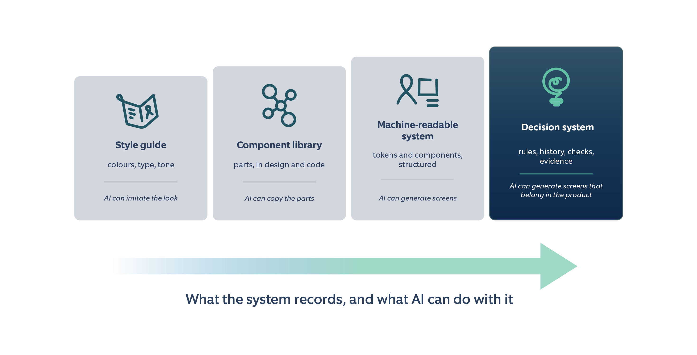
Figure-1-From style guide to decision system what the system records and what AI can do with it

Figure 1. From style guide to decision system: what the system records, and what AI can do with it. 


Take a dialog. The readable version is what most systems already publish: a Dialog component with size, variant and dismissible props, tokens for elevation and scrim, and a design component with matching variants. A tool can render that perfectly. The decision-ready version adds the rules an experienced designer applies without thinking. Use a dialog only for a decision that blocks the current task, and otherwise use an inline panel or a side sheet. Never open a dialog on top of another dialog. Allow at most one primary action in the footer, and if that action is destructive, style it as destructive rather than primary. When the dialog opens, move focus into it, and when it closes, return focus to the element that opened it. Each of these rules can be written so that a linter, a test or an AI agent can check it, and each one prevents a class of defect that no token file can.

A decision system makes those rules reusable, inspectable and teachable, instead of rediscovered under deadline by whoever happens to remember the last argument. 

Record intent, not only inventory

For every important component or pattern, a decision system should record what it is and which problem it solves, why it was built and what it replaced, and what has changed since and why. That last part is the decision log: previous versions, rejected alternatives, and the research or incidents behind each change. The record should also say when to use the component and when not to, which states and variants must exist, which accessibility requirements apply, which production component implements it, and how the team will check that it was implemented correctly.

That is intent: purpose, history, appropriate uses, exclusions and evidence. Without intent, the system is a catalogue. With it, the system becomes guidance that people and tools can apply under pressure. The history matters more than it seems. Without it, a team or an AI tool will happily reintroduce a variant that was removed two years earlier for a good reason nobody wrote down.

Take the danger button. An inventory says it is red. A decision system also says when to use it, based on how much damage the action can do. If the action can be undone, like archiving a message, it runs straight away and offers undo. If it can be undone only for a while, like moving a project to the bin, the user is told how long they have to restore it. If it is permanent, like deleting a workspace, the user must confirm first, with the safe option selected by default. Once these rules are written down, an AI tool will not create a one-click delete for something that can never be recovered.

Mapping design decisions by hand-1

Design and code must name the same thing

A decision system only works if the component in the design tool and the component in production are the same object, not close cousins. That is design and code parity, and it has a precise meaning: the same name, the same props or variants with the same values, the same states, the same tokens and the same accessibility behaviour. If the design library has a Button with a Tertiary variant and the code has variant="ghost", they are two components that happen to look alike.
When designers and engineers use the same name for different things, AI inherits the confusion. It generates against whichever representation it can see. Mapping each design component to its production implementation, the connection that tools such as Figma Code Connect make explicit, is how a system keeps one definition of what "this component" means. Parity also has to be checked, not just declared: compare the variants in the design library with the component API on every release, and treat a mismatch as a defect.
A more capable model does not fix a split source of truth. It produces plausible output faster on top of it. If the design library and the code library disagree about states, properties or accessibility behaviour, every generated screen inherits the disagreement. Aligning them is work up front that pays back in every release that follows.

Accessibility belongs inside the decision

Accessibility is still often left to a final audit. By then the structure is already built, and fixing it means rework, which is costly and, in the EU, a legal risk.

In a decision system, accessibility is part of how each component is defined, following WCAG 2.2 level AA. For a text field, that means it always has a visible label, because placeholder text is not enough. Errors are explained in words, not just shown in red, and they tell people how to fix the problem. Screen readers announce those messages without pulling the user away from where they are. The focus indicator stays visible and is never hidden behind a sticky header, the text has enough contrast to read comfortably, and the field tells assistive technology what it is and whether something is wrong.

The same care applies to every state the field can be in: error, loading, success, disabled and read-only. These are everyday situations, and each one needs its own definition. A component that only documents the ideal state is incomplete.

These rules then become checks. Automated tests catch the obvious problems on every change, and people test with a keyboard and a screen reader for what automation cannot judge, such as whether a label actually makes sense. If the rules exist only in a specialist's head, AI will not apply them, and many people will not either. Quality has to be built into the component itself instead of depending on someone spotting the problem at the end.

Examples and anti-examples

Good examples show what to do. Anti-examples teach how to judge, and for AI they are often more useful, because the most common mistakes are the ones that look plausible.

For each pattern, show a correct result next to the mistakes that resemble it, and explain in one sentence why each mistake fails. Many of the anti-examples we see most often in enterprise products are in data visualization. A dual-axis line chart comparing revenue and conversion rate looks efficient, but readers infer a relationship from wherever the two scales happen to cross, and two aligned charts or a table are more honest. A pie or donut chart with nine categories makes values a few percent apart impossible to tell apart, where a sorted bar chart or a table works better. Status shown only by a red, amber or green dot fails WCAG and disappears for colour-blind users, so the colour needs an icon and a text label beside it.

Interaction patterns have their own. A data grid with infinite scroll fails when users need to compare rows, select across pages or return to a row later, and pagination, or a virtualized table that keeps its position, fits that task better. A skeleton loader whose layout differs from the loaded content makes the page jump when the data arrives. A disabled submit button with no explanation leaves users guessing what is missing, and keyboard users may not be able to focus it at all. Keeping it enabled and showing the errors on submit avoids both problems.

The decision system earns its name when it makes the rejected alternatives visible. That is how expertise stops being a handoff and becomes shared infrastructure. AI should reduce handoffs without removing expertise, and recording anti-examples is one of the most practical ways specialists can scale their judgment.

Examples and anti-examples guide decisions-1

Quality must be testable

Guidance that cannot be checked will not survive generation at scale, and that changes the role of quality assurance.

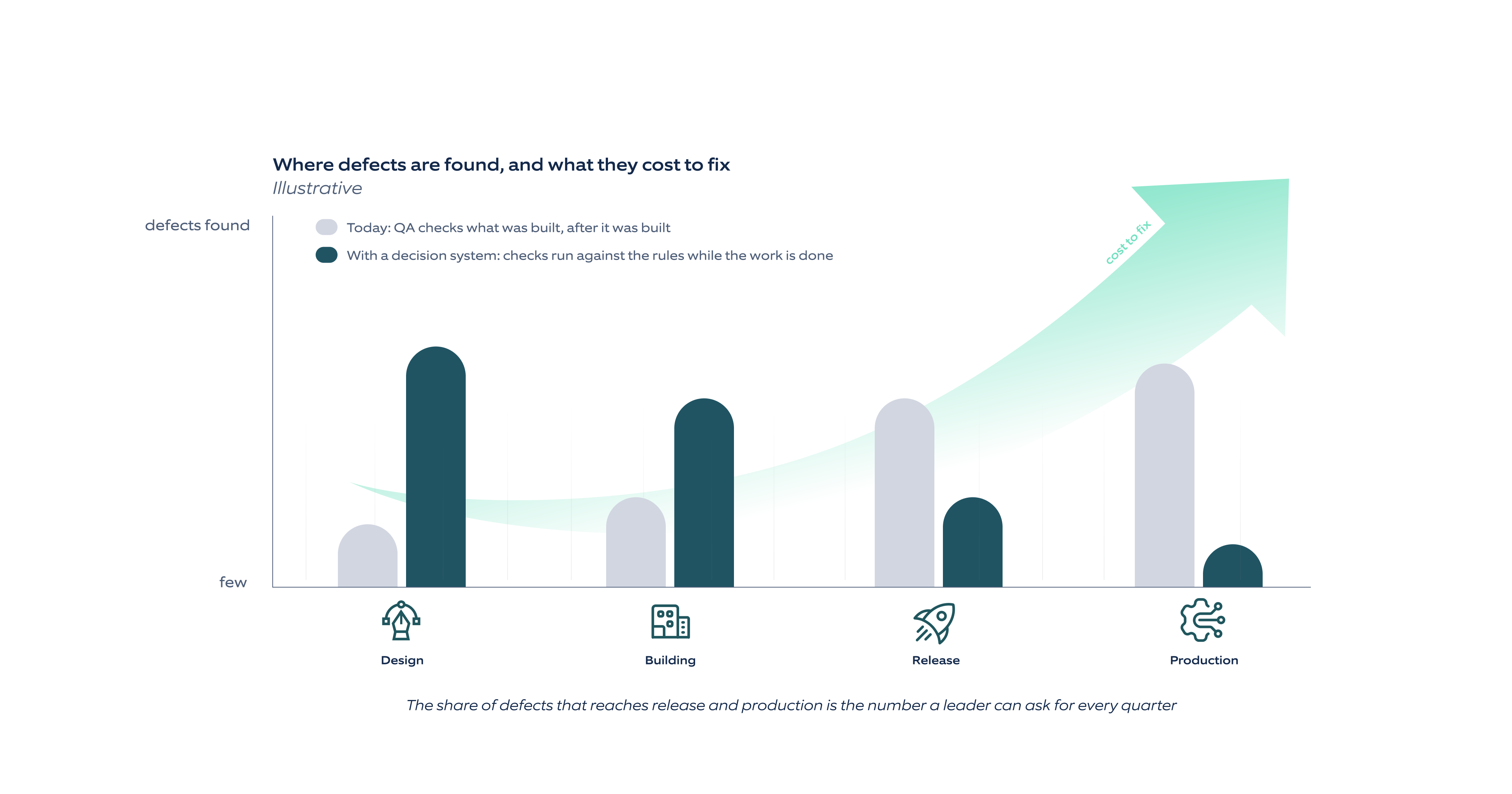
Today, QA mostly checks what was built after it was built, much of it by hand. Issues surface after implementation, when they are more expensive to fix. Code slowly drifts away from the design system and the intended experience. Manual regression testing is slow, inconsistent and hard to scale as the product grows, and because requirements, designs and code live separately, it is hard to trace what was asked for.

Once the design system's rules are machine-readable, QA can validate work against them throughout the workflow and catch issues before they reach production. Tokens, components, states and patterns define what should exist, so deviations can be flagged. Design-system, accessibility, responsiveness and code checks run automatically on every change, and requirements and design decisions become explicit validation criteria that AI can check.

Figure 2-Where defects are found today and where a decision system moves themFigure 2. Where defects are found today, and where a decision system moves them.


Some checks can be fully automatic: whether the approved production component was used, whether the required states are present, and whether contrast and focus behaviour meet the bar. Others need a rubric and human review: whether the view still feels like the product, whether there is one clear primary action, and whether the destructive path asks enough of the user before it runs.

Evals, repeatable tests that check whether AI uses the system correctly, turn those rubrics into evidence. Give a model the same set of briefs after every change to the system, score the output against the rules, and track the score over time. Evals do not replace design critique. They show whether the decision system is actually steering the output, or whether people are still cleaning up after it.

MCP makes this knowledge available at the moment of generation. An AI tool can query the relevant component rules, tokens and examples when it needs them, instead of relying on what the model remembers from training or from a PDF. Connecting the knowledge is useful, but it does not make a design system decision-ready on its own. Someone still has to write the decisions.

A workable model looks like this. AI monitors usage and flags patterns, for example several product teams overriding the same card padding, or a component that is often detached in the design tool. It drafts a proposal with the evidence attached. The design system team reviews it like any other change request and accepts it, rejects it or asks for research. Every accepted change gets a decision record (what changed, why, and what was rejected) and a versioned release with a changelog and, where needed, a deprecation path. Rejected proposals are recorded too, so the same idea does not come back every quarter.

The design system team stays accountable for the standard. Code shows what exists. People decide what should exist, what fits a given situation and what is good enough to release. The decision system is how those decisions stop living only in meetings.

Humans decide what becomes a rule

AI can find repeated problems, suggest new guidance and draft the first version of a pattern note. None of that transfers ownership.

What to do next

Pick one component that is used everywhere and causes regular debate. Dialogs, data tables and form fields are good candidates. Write its decision record in a structured format that people can read and an AI tool can query. Start with its purpose, including the problem it does not solve, then say when to use it, when to avoid it and what to use instead. Add its history: why it was built, what changed, what was rejected and why.

Then cover what implementation depends on: every required state and variant, named exactly as in design and code; the WCAG 2.2 criteria that apply, with keyboard behaviour and screen reader output; and the production package and component, mapped to the design library. Finish with the common mistakes and why each one fails, the automated rules and human review rubric that check the component, and the evidence from usage, adoption, overrides and usability findings.

Then test it. Give the record to your AI tools, through MCP or the tool's own context mechanism, ask them to build three screens that use the component in different situations, and score the results with the checks you just wrote.

The exercise shows quickly whether the design system is merely readable or decision-ready. If the record is hard to write, the system is not ready for AI, and it is less ready for people than it looks. If it is easy, you have the first entry of a decision system, and a standard the rest of the library can be measured against.

FAQs

The Future of Design Systems in the Age of AI

Get in touch

The design system is becoming a decision system